 |
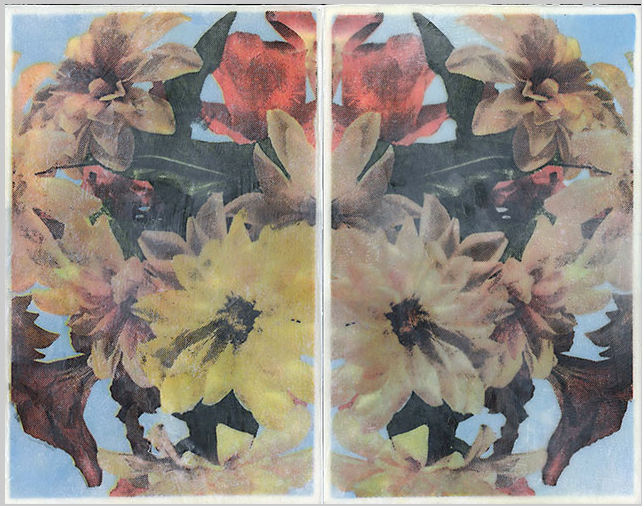
| Flowers, Wayne Montecalvo. CMYK screenprint on tengucho tissue with encaustic wax |
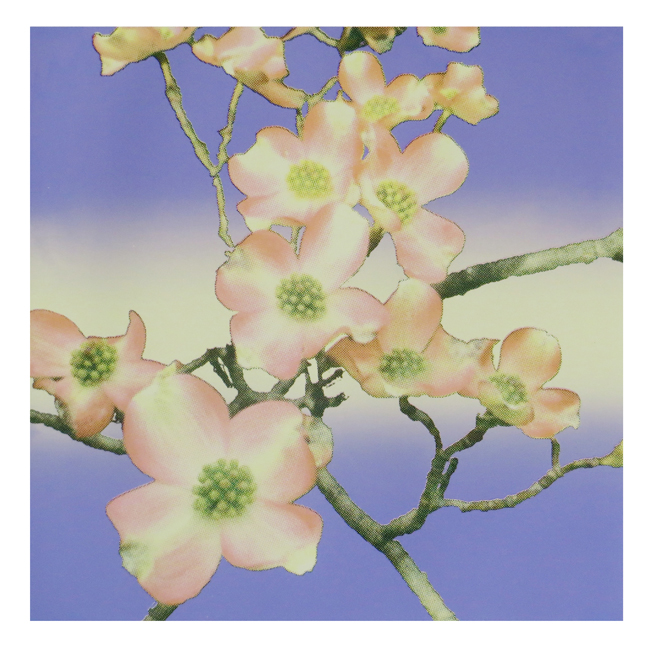 |
Spring, Allan Akman. CMYK screenprint with split fountain background.
|
Wayne Montecalvo and
Allan Akman have a thing for spring. Both artists have used flower imagery to explore the process of
CMYK screenprinting. Starting in photoshop, a color image is separated into the 4 channels used for offset printing: cyan, magenta, yellow and black. Each color plate is converted to printing dots (as seen in the newspaper) and assigned its own angle to prevent a moiree pattern. These separations are then used as plates for screen printing, and as a jumping off point for experimentation. Montecalvo screenprints his color on to translucent tissue, and then reassembles the image by fusing the layers with encaustic wax. He deliberately tweaks his palette to evoke the greenish cast of
chromolithography printing.
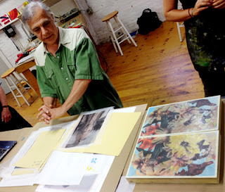 |
Wayne Montecalvo shows his process and pieces
at R+F Paints in Kingston, NY. |
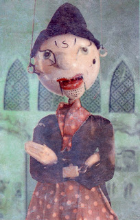 |
Puppet, Wayne Montecalvo.
6 color screenprint on gampi paper
with encaustic wax. |
|
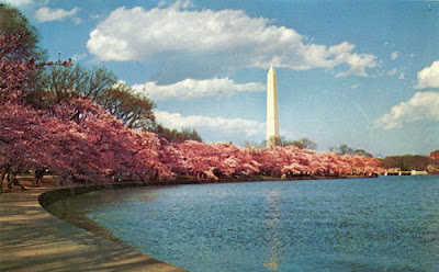 |
| Chromolithograph postcard |
In his work
Spring, Screenprint Society regular Allan Akman stayed true to the color assignments (i.e. printing the yellow plate in yellow), but with a twist: he first laid down a split fountain gradation background. Says Allan:
"I didn't know if I could pull this off but liked the results. Started using the color separation approach … but could never get the gradations and subtlety that I wanted. That led me to try CMYK. I also learned along the way that printing flowers using color separations can be done. I visited Lou Stovall in the process and he showed me very pretty flower prints he had done. To capture the color gradations and detail, he used maybe 30-40 screens."
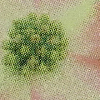 |
| Spring, detail, showing halftone dots |


Hi - In photoshop do you have a recommended lines per inch to use when creating halftone? My results are inconclusive here;
ReplyDeletehttp://community.sundried.com/blog/screen-printing-t-shirts-bitmap-lines-per-inch
I think you’ve answered your own question. As you show on your Sundried website, different lpi give you different results, any one of which is fine depending on what you’re trying to accomplish. For my “Spring” print, the halftone is a different process than you are using for t-shirts. “Spring” is a CMYK print which I developed using Photoshop’s color halftone filter. Settings for this project were Max Radius 8, C 108, M 162, Y 90, K 45. For another project, “WOW!”, which is probably more similar to your t-shirts, I used 35 lpi. But, this only worked after adjusting the light values of the five photos I used in the image and experimenting with different lpi. 35 lpi seemed to work best. Bottom line: use the lpi that works for your project as you envision it.
DeleteFascinating information I haven’t been experienced such information in quite a long time.
ReplyDeleteprinting